SSC HSC Graph/Chart

Describing Graphs, Tables and Charts
What is a chart?
A chart is a diagram that makes information easier to understand by showing how two or more sets of data are related. There are two common types of chart, a pie chart and a bar chart.
1. A pie chart is a circle divided into segments . It is usually used to show percentages.
2. A Bar chart is a diagram that makes information easier to understand by showing how two or more sets of data are related. A bar chart is divided into columns .
1. The graph below shows the Internet Users from 2005 to 2013. Describe the graph in 150 words. You should highlight and summaries the information given in the graph.

The Internet Users from 2005 to 2013
Answer: The graph shows the percentage of people using the internet from the year 2005 to 2013. The graph, at a glance, shows a tremendous rise of internet users over the years. In 2005, only 5% of people used the Internet. The next year, that is in 2006, this rises to 8%, which means that in one year’s time 3% more people began to use the Internet. This trend of growth accelerates in next years. We find that in 2007, 11% of people used the internet. The next year, that is, in 2008, it becomes 16%, so the increase in one year is 5%. Again, if we study the graph we find that the percentage of people using the internet increases faster between 2009 and 2010. In 2009 the percentage was only 21 while it rises to 32 in 2010, which means that in one year’s time 11% more people began to use the Internet. However, there is a little increase, between 2010 and 2011. In 2010 it was 32% and in 2011, it rises to 35%, that is a growth of only 3%. But from 2011, again the trend of growth goes faster. Thus, we find that between 2011 and 2012, there is an increase of 7% (41%-34%) users. In 2013 the percentage rises to 54 from 41, that is 13% increase occurs between 2012 and 2013. To sum up, we can say that within a span of eight years the users of Internet rises from 5% to 55% which means a very significant growth of the users of the internet over time.
2. The graph below shows yearly imports and exports (Billion Dollars) of a country. Describe the graph in 150 words. You should highlight and summarize the information given in the graph: –

Yearly Imports and Exports
Answer: The graph shows yearly imports and exports of a country in billion dollars. At a glance, it shows that both imports and exports of the country have increased significantly over time. In 2010 the exports and imports respectively were 12.45 billion dollars and 15.00 billion dollars. Within a span of four years’ time, that is in 2014, they rose to 23.45 billion dollars and 32.15 billion dollars respectively. However, from the graph, it is noticeable that from 2010 to 2014 the exports and imports of the country have increased except in 2013. A decrease occurs in this year. From the graph, it is also clear that the country’s import expenditure is much higher than that of its export. But a positive aspect is that over time the country’s import ability increases along with its increase in exports. If calculated separately we find that in 2011, the increased export amount is 0.62 billion dollars and in 2012 it is 3.95 billion dollars. In 2013 the export has a decrease of 2.68 billion dollars. But in 2014 it has again an increase of 9.11 billion dollars than the previous year. Therefore, the highest increase occurs in the year 2014. Similarly, as regards import, we notice the increase of 3.40 billion dollars in 2011; the increase of 3.85 billion dollars in 2012, but a decrease of 2.20 billion dollars in 2013 and 12.10 billion dollars increase in 2014. Thus the highest increase occurs in 2014. This way the graph shows a clear picture of the amount of import and export of a country over a period of four years from 2010 to 2014.
3. The graph below shows the ‘Literacy Rate‘of Bangladesh from 1995 to 2010. Describe the graph in 150 words. You should highlight-and summarize the information given in the graph.

Literacy Rate of Bangladesh from 1995-2010
Answer: The graph gives an idea about the literacy rate of Bangladesh over the years between 1995 and 2010. The graph shows an irregular rate of increase and decreases in some years from 1995 till 2010. In 1995, the rate was 38.1% which is the lowest of all. However, in the next five years there is a significant growth in literacy, and from the graph, we find that in 2000, the literacy rate becomes 56%. So, within five years’ time, there is (56-38.1=) 17.9% growth in literacy. However, the rate goes down after 2000. Thus, we find that in 2001 the rate comes down to 47.9% from its previous year-rate, 56%. There is still a downward trend in the next two years. The graph shows that in the year 2003 the rate falls from 47.9 to 43.1. This means that within two years there is a decrease of (47.9-43.1=) 4.8% literacy rate. However, from the next year, that is from 2004, the rate of literacy goes upward. Within a span of seven years, this rate becomes 56.8%. It means that within a period of seven years there is (56.8-43.1=) 13.7% increase in literacy rate. The overall analysis of the graph shows that the highest rate of literacy between 1995 and 2010 is 56.8% and the lowest is 38.1%. Though there is a decreasing trend between the years 2001 and 2003, the overall trend is on the increase. Thus, it is found that within a span of sixteen years the literacy rate increases from 38.1 to 56.8, which is a very significant growth. Thus, the graph gives a good idea and the trend of literacy rate in Bangladesh from 1995 till 2010.
4. The graph below shows the number of mobile phone users in Bangladesh. Describe the graph in 150 words. You should highlight and summarise the information given in the graph:

Number of Mobile phone users in Bangladesh Graph
Answer: The graph shows the number of mobile phone user in Bangladesh between the years 2008 and 2012. At a glance, the graph shows that the number of mobile phone users has increased very remarkably in a span of four years. According to the graph, only 30% of people used a mobile phone in 2008. The percentage increases gradually exception in 2011. In 2012 the number of users turns 88%. However, the increases do not occur equally in each year. Only 5% increase occurs in 2009. But next year, that is in 2010, 38% (73%-35%) increases occurs. But In 2011 2% decrease occurs. In 2012 there occur moderately higher increases. This year 17% (88%-71%) increases taken place. Thus we can say that there is a higher trend of increase of the mobile phone users from the year 2008 to 2012 except in 2011. The very remarkable increase occurs between 2009 and 2010 and between 2011 and 2012.
5. The graph below shows the results of SSC exam of ABC Secondary School from 2008 to 2012. Describe the chart in 150 words. You should highlight and summaries the information given in the chart.

Ans: The graph shows the results of SSC examinations of ABC Secondary School from 2008 to 2012. In general, the graph shows a gradual improvement of the SSC candidate’s performance within this time. It is seen from the graph that the pass rate increased from 60% in 2008 to 92 % in 2012.
The graph also shows an increase of candidates who passed with a GPA 5 except in 2011. In fact, the school had the lowest rate of GPA 5 holders in 2011, which was only 9%. The performances of the SSC candidates were almost similar in 2009 and 2010, with slightly better results in 2010. The school recorded the best results in 2012 when the pass rate went beyond the 90% mark. Moreover, a record of 32% candidates passed with a GPA 5 in this year.
6. The graph below shows The number of people in percentage, living below the poverty line” from 1995 to 2010. Describe the graph in 150 words. You should highlight and summarize the information given in the graph: –

People Living Below Poverty Line
Answer: The graph shows the percentage of people living below the poverty line in a particular country from the year 1995 till 2010. The graph shows that 35.6% of people lived below the poverty line in 1995. In the next few years, poverty grows higher. The graph shows that nine years later, that is in 2004, the population below the poverty line is 45%. Therefore, over nine years poverty level rose 9.4% higher. However since the year 2004, the trend of poverty decreases. Within the next four years, the percentage of people living below poverty is decreased to 36.3% from its previous 45%, which means that within four years 8.7% of people come out of their poverty line. There is a further decreasing trend of poverty level after 2008. The graph shows that in 2010 the percentage of people living below the poverty line is decreased to 31.51% from its previous 36.3%. Therefore, from the graph, it is clear that more people go below the poverty level between the years 1995 and 2004. Again many people come out of the poverty level between the years 2004 and 2010. According to the graph 2004 is the year when the highest number of people (45%) lived below the poverty line while 2010 is the year when the lowest number of people (31.51%) people lived below the poverty line. Thus the graph provides a clear picture of the trends of rising or fall of people living below the poverty line from the year 1995 to 2010.
7. Look at the following graph. It shows comparative selling rates—Of four types of books in Ekushey Boi Mela, 2018. Now describe the graph in 150 words.

Ekushey Boi Mela Book Sales
Answer: The graph shows a comparative selling rate of the four types of books in Ekushey Boi Mela 2013. These four types of books are Science Fictions, Novels, History, and Poetry. Of these four types of books the Novels were sold higher than any other type and its number is about 4200. The second highest in selling is the Science Fictions, the number of which is 3000. The third position in selling is History and its number is 2200. The lowest in the sale is the poetry books. Its number is about 600. Analyzing the graph we can say that out of the sold 10,000 books the number of Novels is 4200, Science fiction is 3000, History is 2200 and Poetry is 600. Therefore if we make a list of the categories of books from the highest selling rate to the lowest then we find this serial: Novel, Science Fiction, History, and Poetry. At a glance, the graph shows that Novels occupy the highest position in selling rate and Poetry has the lowest position. The other two types of books History and Science Fiction remain in between. Thus the graph gives a very clear picture of the four types of books sold in the Ekushey Boi Mela 2018.
8. The following graph shows a group of students and their choice of hobbies. Write a report on the graph.

Choice of Hobbies by Students
Answer: The graph shows the choice of hobbies for a group of students. These hobbies are the practice of music, watching TV, reading books, using computer and stamp collection. The graph shows that the highest number of students (here it is 24 students) choose reading books as their hobby. The lowest number of students (here it is 08 students) choose watching TV as their hobby. 22 students like a stamp collection. 14 students like the practice of music, 13 students like using a computer. Therefore. in preference of hobbies, stamp collection is in the second position, practicing music is in the third position and using the computer is in the fourth position. The graph also shows the closeness of choice in the matter of using the computer, practicing music and watching TV. Therefore, according to preference (from highest to the lowest), the hobbies are reading books, stamp collection. practicing music, using a computer and watching TV.
9. The graph below shows the choice of profession by differently educated people. Describe the graph in 150 words. You should highlight and summarize the information given in the graph:

Choice of Profession by Educated
Answer: The graph shows the choice of profession by different educated people. According to the graph, more than 60% of educated people choose Govt. job as their career. Business is liked by 25% educated people, farming is chosen by 10% people and only 5% people like intellectual work as their profession. Analyzing the graph, we see that most educated people’s choice is for govt. job. Again, the least number of people like intellectual work as a choice of their professional career. Compared to fanning and intellectual work more people like a business. Thus, we can say that farming is liked by more people than that of intellectual work. Again, business is liked by more people than that of farming. Again, Govt. job is liked by more people than that of business. Therefore, serially from lower to higher these professional careers are intellectual work, farming, business, and Govt. job.
10. Look at the chart below. It is about the choice of profession by differently educated people. Now describe the chart in your own words.
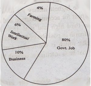
Answer: The chart shows the choice of profession by differently educated people. Educated people prefer govt. Job, farming, business, and intellectual work. A lion share of educated people like govt. Job the participant in govt. Job is 80%. It for our numbers the other professions. Then only 10% of educated people like to run a business. It is 70% less than govt. Job. Less educated people prefer intellectual work. The percentage digit is only single which is 6%. On the other hand, only 4% of educated people like farming. So, govt. the job gets the highest professional value whenever farming gets the lowest. However, the difference between the highest and the lowest preference is 76%.
11. Look at the following pie-chart. It shows “the passing rates of different subjects of a school” in the SSC Examination. Describe the chart in your own words.

The Passing Rates of Different Subjects of a School
Answer: The pie-chart shows the passing rate of different subjects of a school in the SSC examination There are four subjects showing the chart. These subjects are; Bangla, English, Mathematics, and Science. The graph shows that the highest number of students pass in Bangla and it is 90%. The second highest is in English and this is 89%. Again, 87% of students pass in Mathematics and 74% of students pass in Science. From this chart, it is clear that the highest number of students pass in. Bangla and the lowest number of students pass in Science. From the graph, we can also calculate the rate of failure in these subjects. It is found that 10% of students fail in Bangla, 11% fail in English, 13% fail in Mathematics and 26% fail in Science. If we make a list considering the highest passing rate to the lowest, the serial goes like this: Bangla, English, Mathematics, and Science. Thus, the pie chart very clearly shows the percentage of students passing in these four subjects.
12. The pie chart below shows the interest of the students of a secondary school in different subjects. Describe the chart in about 150 words. You should highlight and summarize the information given in the chart :

Answer: The pie chart shows the interest of students of a secondary school in different subjects. These subjects are Mathematics, Science, English, and Bengali. The percentage of students like these subjects respectively are 35%, 27%, 17%, and 21%. Thus the graph at a glance shows that the highest number of students have interest in Mathematics, and this is 35%. The lowest number of students like English and their percentage is 17. Science is liked by 27% students, and Bengali is liked by 21% students. In order of interest from higher to lower the subjects are Mathematics, Science, Bengali, and English. It is clear from the chart that the student of this secondary school has more interest in Science subjects and less interest in language subjects. The least interest is found in English.
The pie chart below shows the percentage of transportation used y 800 students to come to a school. Describe the chart in 150 words. You should highlight and summarize the information given in the chart.
13. Types of Transportation Used by The Students

Answer: The pie chart shows the percentage of transportation used by students in a school. According to the chart there is a total of 800 students in the school. They have four means of transportation. These are using bicycle, using car, using bus and by walking. The chart shows that the highest percentage of students use bicycle to go to their school. This is 45%. So, their number is 360 (45% of 800 = 360). The second highest percentage of students use the bus as their means of transportation, and this is 30%. So, their number is 240 (30% of 800 = 240). According to the chart, we find that 15% of students go to school on foot. So, their total number is 120 (15% of 800 = 120). The pie chart also shows that the lowest number of students use car to go to their school. This is only 10% that means, only 80 students. Based on the above information we can say that out of 800 students 680 (360 + 240 + 80 = 680) students use vehicles to go to their school and the remaining 120 students go to school on foot.
14. The chart below shows the benefits of girls’ education. Describe the chart in 150 words. You should high-light and summaries the information is given in the chart.

Benefits of Girls/Female Education
Answer: The chart shows the benefits of girl’s education. Educated girls are conscious of their health and nutrition. Their knowledge of nutrition enables them to provide their children with a balanced diet. Thus, they contribute to building a healthy generation. Again, an educated girl is aware of the population explosion of a country. Naturally, an educated woman will not take more children. Thus, an educated woman helps the nation to control the population. Again, an educated woman is capable of doing more productive work. She can apply her knowledge and talent in every aspect of her life. Like educated men, they can join the workforce outside the home. They can be doctors, engineers, high officials in the Govt. and so on. Consequently, they themselves can improve their living conditions contributing to the economy of the country. In fact, sustained development efforts can be successful only when both men and women of a country become educated. No nation in today’s world has made enough progress keeping their women illiterate. Thus from the chart, it is clear that girls education contributes a lot to the development of a nation.
15. The pie chart below shows the sources of air pollution in a city. Describe the chart in 150 words. You should highlight and summarize the information given in the chart.

Sources of a City Pollution
Answer: The pie chart shows the pollutions of a city with five different sources. These are the vehicles, industries, power plants, heating or air conditioning and waste disposals. The chart shows that the highest level of pollution is caused by vehicles, and it covers 60% of the total pollution. The second rate of pollution is caused by industries which cover 17%, of the total pollution. The third sources are the power plants which covers 14% pollution. Heating or air conditioning sources also contribute to pollution which is 6% of the total. Next comes the pollution by waste disposal which is 3% of the total. From the chart, it also becomes clear that the rate of pollution is very close by industries (17%) and by power plants (14%). But the highest level of pollution is caused by vehicles. The lowest rate of pollution has been caused by waste disposal. It is also clear that the rate of pollution by heating and air conditioning is double the rate by waste disposal. The sources of pollutions chronologically from the lowest to the highest are waste disposal, heating, and air conditioning, power plants, industries, and vehicles.
16. The pie-chart below shows the percentage of a family’s household income distributed into different categories. Describe the pie-chart in 150 words: –

The Percentage of a Family Expenditure
Answer: The pie chart shows the percentage of a family’s household income distributed into some categories. These are food, clothes, education, power, transport, saving and others. According to the chart, the family’s highest expenditure is on food, and it is 25% of the total income. The lowest expenditure is on power which is 5%. However, the family spends 22% of its income for education, 13% for clothes. 12% for transport. Besides the above, the family spends 8% of its income in some other purposes which have been shown as ‘others’. After spending money in all these categories, the family saves some money, and this is 15% of the total income. From the graph, it is clear that the family’s total expenditure is 85% of its income, and the savings is 15%. If we make a list of the categories of expenditure from the highest to the lowest we find this serial: Food, education, clothes, transport, others, and power.
17. Look at the following graph. It shows the main reasons for the study among students of different age groups. Now, describe the graph in your own words.
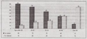
Reasons for the Study
Answer: The graph shows people of some age groups and the two purposes of their reading one for the purpose of career and the other for pleasure or interest. The age groups are: under 26, from 26 to 29, from 30 to 39, from 40 to 49 and over 49. A common trend is that young people read more for career purposes and less for purpose of pleasure or interest. On the other hand, older people read more for pleasure and less for a career. From the graph, we can find a gradual rise and a gradual fall in the two types of reading based on age. Those who are under 26 mainly read for a career. Here out of 90 candidates, 80 candidates read for career and only 10 candidates read for interest. In the next age group (26-29) we find that 70 people read for career and 20 people read for interest. This gradual change continues and with people over 49 we find that out of 85 people only 15 read for career and 70 read for interest. Therefore, with the gradual increase in age, the purpose of reading changes significantly.
18. Look at the chart below. It shows the monthly expenditure of a family. Describe and analyze the chart.
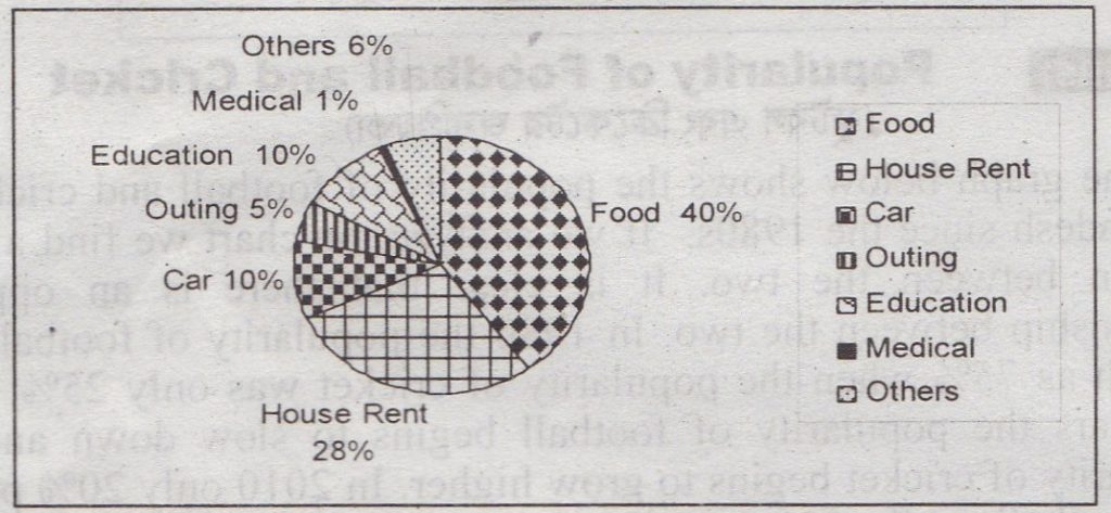
A Family Expenditure
Answer: The chart shows the monthly expenditure of a family. From the chart it is clear that the family’s highest portion of monthly expenditure goes for food and it is 40% of the total expenditure. The family spends 28% for house rent. Thus it is seen that nearly three-fourths of the total expenditure, that is (40+28=) 68% goes for food and house rent. The family has a private car and 10% of the total expenditure goes for maintaining the car. The same portion that is 10% is spent on education. The family goes for an outing each month and for this, it spends 5% of its total expenditure. For medical purposes, the family spends 1%. Apart from these specific expenses, the family has some other expenditure that has been shown as ‘others’. For ‘others’ the family spends 6% of its total monthly expenditure.
19. Look at the Chart below. It shows the pastimes of the students of classes 9-10 and classes 5-6. Describe the chart in 150 words. You should highlight and summaries the information given in the chart.

Pastimes of the Students
Answer: The chart shows the pastime activities of the students in classes 9-10 and classes 5-6. Both the groups of students pass their leisure in some activities. These activities are: watching television, playing games on the computer, reading books and magazines, and doing games and sports. However, there are variations in preferences of choice of the students. The highest percentage of students of classes 9-10 (30%) like to spend their free time playing games and sports while the same activity is chosen by the lowest percentage of students of classes 5-6 (17%). Again, the majority of classes 5-6 students (34%) want to pass their time in watching television while less percentage of students of classes 9-10 (27%) spend their leisure in this activity. As regards reading books and magazines the percentage of students from both the groups are very close. It is 23% with the students of classes 9-10 and 21% with the students of classes 5-6. The lowest percentage of students in classes 9-10 (20%) like to play games on the computer while the same activity is liked by 28% of students in classes 5-6. Thus, significant variations of choice are noticeable in the same pastime activities between the two groups of students.